
Last modified: 2009-09-12 by antónio martins
Keywords: politics | cdu | pcp pev | hammer and sickle (blue) | sunflower |
Links: FOTW homepage |
search |
disclaimer and copyright |
write us |
mirrors
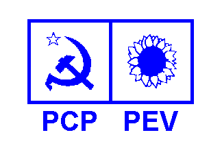
This image is quite accurate. The symbols are usually a little bigger,
particularly the sunflower, but that’s very close. If I recall correctly,
there’s an hyphen between the two acronyms on the logo.
Jorge Candeias, 20 May 1999
The flag is a white background with two adjacent white squares
outlined in blue, the left square enclosing the sickle and hammer of
PCP in blue plus a white star fimbriated blue
and the right square containing thesunflower from the
Greens, with blue centre and white petals outlined in blue. Below this
symbol lie the initials PCP - PEV, also in blue. Interestingly, this
left-wing coalition uses the colours of… the
monarchics!
Jorge Candeias, 20 May 1999
The letters came in the typeface "Ottawa", the Microsoft aka-name for
"Optima", aka "Humanist 512".
António Martins, 18 May 1999
The change from the previous flag to the twin logo
happend when the portuguese parliament passed a law stating that political
party coalitions could not use any other logo than the logos of the
constituent parties, which was made so to force the communists to use their
own acronym and symbol in the elections.
António Martins, 18 May 1999, and
Jorge Candeias, 20 May 1999
Coalition of the Portuguese Communist Party and
the Ecologist Party “The Greens”.
(By the way, no relation with german C.D.U.,
this is a communist organization!)
António Martins, 18 May 1999
A previous flag had the coalition’s own symbol (three white hexagons
pointing up thickly fimbriated blue, 1+2) on a white background, supposedly
with lettering "CDU" or "CDU — Coligação Democrática Unitária".
António Martins, 18 May 1999
If I recall correctly, both versions of lettering where used, and it (the
lettering) was always there. Sometimes an arrangement of “graffiti-style”
red and green lines was added.
Jorge Candeias, 20 May 1999
Before that, C.D.U. used as symbol three chain links
likned toghether, green, red, green, on white background. Then this coalition
had one more member (M.D.P.-C.D.E.) and it was
called rather APU (Aliança “Povo Unido”); technically it was a
different coalition, but in practice it is all the same, just another name
for the Portuguese Communist Party (the other
parties are quite small).
António Martins, 18 May 1999
And even before, it used the name "FEPU" (Frente Eleitoral “Povo
Unido”) and the rings where thick hollow lozenges in the same colours.
I’m not sure if the change of name corresponded in time to the change of
symbol.
Jorge Candeias, 20 May 1999
Anything below this line was not added by the editor of this page.